Creating a logo and brand colours to suit your new or rebranded business is a very personal choice and one that should only be made by the business leader or leaders.
A logo would ideally mirror what the brand represents, be instantly recognisable, and stand out as unique to the business.
However, there are some modern day considerations that should be factored in when choosing a new logo, which are often overlooked.
The most important consideration is the need to embrace a new and electronic modern world. For most businesses the majority of branded literature produced will be electronic.
Whether that be websites, pdf’s, presentations, e-brochures, emails, advertising or social media posts, having a logo that works for e-viewing is the most important aspect to get right these days.
Simplicity is the new modern way…
Intricate logos just do NOT work as well electronically, multiple colours and gradients are much more difficult to work with across multiple platforms.
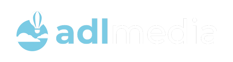
Simplicity is the new modern way, as your logo will almost certainly need to sit on a variety of backgrounds and imagery. For this purpose, the colours in your logo would ideally be adaptable – as demonstrated below.
We’ve worked with many logos and colours over recent years, and have come to the conclusion that the most effective solution for multiple design is a three-colour logo. Ideally this would include white, or an off-white, a medium shade and a darker shade.
By going this route, the colours are effectively inter-changeable on different backgrounds, giving you the opportunity to create great branded content. The three-colour philosophy is demonstrated in the previous image above and below.
Over complicating the icon or symbol that forms part of your logo is another thing to avoid. A flat simple image is much more ‘design friendly’ for your online content than using bevels or gradients.
Major global brands, such as Apple and Amazon, spend millions on branding and marketing every year, and there is very little complicated about the symbols they have chosen to represent them.
Having said that, it is worth considering whether you actually need a symbol. Many major brands have chosen text only logos that are still instantly recognisable, such as Ebay or Google.
We do a lot of our work in the logistics industry, where many of the logos used are a globe, airplane, ship or truck. While this gives an indication of what they do, it doesn’t really differentiate, and let’s remember that Apple are not selling fruit.
The image could reflect the name, or say something about what the brand stands for. A logistics brand might be better represented by symbols that reflect their strengths, their people, their customer service ability, their integrations, their speed or a host of other characteristics.
It is important that you choose an icon or symbol that means something to you and ideally one that can be explained or is automatically understood as being synonymous with you.