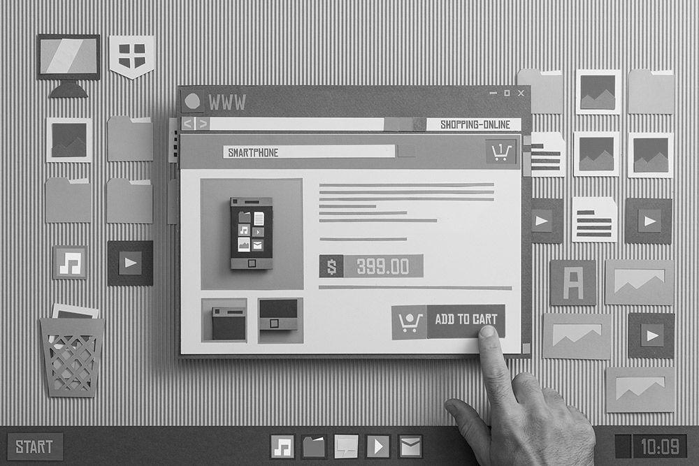
Websites have been around for over a quarter of a century, and now dominate the way we gather information, communicate, shop, and in some cases our social lives too. A company website is the sharpest of our marketing tools, whether we intend it that way or not.
One thing we can be sure of is our website will often be the first impression that an audience gets of our brand. In all likelihood, whether buying from us for the first time, selling to us for the first time, competing with us, considering working for us, or just checking us out, the first look at us from the outside world will be via our website.
When users visit we generally have a short window to catch their attention, as over 50% of views are for less than 15 seconds. A frightening statistic considering the work we put into creating them, but probably an indication that most viewers are simply checking out our brand.
Another important statistic is the growth of mobile and tablet web activity. During 2015 the number of views from these devices surpassed those from desktops and laptops for the very first time. We can probably assume that with most logistics being B2B, our industry is not quite at that ratio yet, but this growth is set to continue, especially now that mobile screen sizes are becoming more and more web friendly.
This means the way in which users read our websites is changing fast. We have to be mobile friendly, which means our websites need to be adaptable. They should accommodate the need to scroll, pan, and push, rather than just mouse click. For example; mobile and tablet users don’t want to zoom in to tiny text for their links, they want to push large buttons or images with their thumbs.
Websites that adapt to the device they are viewed from are known as ‘responsive’, although some respond better than others. Some sites, particularly less modern designs, may just show their content in a more readable format for mobile viewing, while others improve and optimize the experience. Such is the need for mobile friendly, that google now boost responsive websites in their search rankings.
At this point in time, Logistics is not often at the forefront of modern web design. We are an industry where you will often find home pages with all of the information crammed into a small portrait view, offering numerous text links to support pages. That’s not to say this doesn’t work, or look professional, but a fully responsive site will also adapt to wider modern screen sizes in a landscape view. Additionally modern viewers generally expect, or even like, to scroll on all devices, including desktops.
Web Design has seen one-page scrolling websites become a trend over recent years. A one-page website is exactly what it says on the tin, a site where all of the information is found on the one page. The scrolling home page effectively acts as a brochure, and clicking a link takes us to a section of the page, rather than to a separate one.
One-page websites would probably not suit everybody in the logistics sector, but the principal of making our home page brochure-like, scrollable, responsive, modern, uncluttered, and reflective of our brand, makes absolute sense, especially when we consider that most users, in their fifteen seconds, will not be leaving our home page.
1. Keep your website current. Sites that offer news articles, with the most recent dating back 6 months or more, are neglected. You should have access to easily create your own articles, so keep your audience up to date. Even if you have nothing current to say about yourselves, the industry will always have relevant news you can share.
2. Make Good Use of Space. Viewers are used to scrolling on various devices, you can provide more information and promote more by making more use of width and extending the length of pages past the initial view. Don’t clutter everything into small spaces as not every area of the screen actually needs to be filled.
3. Deliver Your Message. What is your differentiator? What are you promoting? What are you about? Deliver the main message you want the viewer to understand in the first section of your website. However, don’t be over clever; using automated carousels and slideshows for delivering your message are often best avoided, since most users won’t wait.
4. Reflect your Brand. Make sure your site gives a good first impression of how you want your brand to be represented; modern yet professional always works!
5. Consider Colour. Your logo may not suit a modern style website, perhaps it’s time to update it, or perhaps choose alternative colours that compliment your logo. Using at least 3 colours with a light (ideally white), dark, and medium shade, often combine well.
6. Use Imagery. Don’t forget that we absorb information in different ways so mix it up with eye catching imagery. This can sometimes deliver messages as efficiently as text, and is more likely to draw attention
7. Drive Your Social Networks. Using a web platform like WordPress enables you to link your website into your social media outlets, from which you automatically post your website articles across all platforms, this also drives traffic back to your site.
8. Think of your Home Page as a brochure. Your website is a promotional tool, so can be presented like a modern day brochure. That said you may have to prioritise what you want to show on your home page as you don’t want to dilute your key attributes.
9. Engage with the viewer. Try to make the website engaging for your targeted audience, not just for you, and remember you may have less than 15 seconds to persuade them to stay, or to link to another page. Ensure navigation is simple and clear to understand.
10. Use Calls to Action. What do you want your viewer to do next? Contact you? Get a quote? Read more? Make sure you encourage them to do so with clear, mobile friendly, links or prompts.


